 |
| Diptyque: Prince @ Mott NYC. |
To be honest the Diptyque
email was barely saved from my trash folder. I was sure it was some kind of
scam as it was international, came with attachments, and a text that launched
into an improbable story. In fact, looking back on it, the whole thing seems
like a dream. Fly from L.A. to New York
and paint a mural thought up in a Parisian design studio in an interior designed
by a London architecture firm. The thing is all my projects have a slightly
preposterous quality. Needless to say once carefully read I realized this email
was completely legitimate.
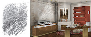 |
| Design concept w/drawing reference. |
 |
| Finished mural. |
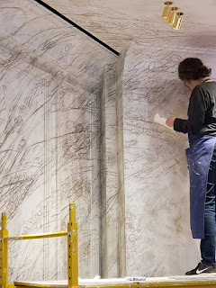 |
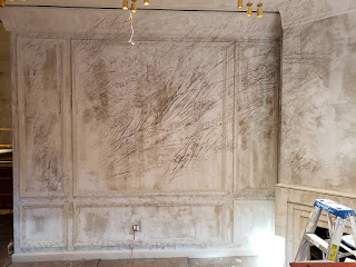
| Mural in progress. |
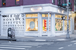
George Haussman
gave Paris the look we associate with Paris and the Prince Street Diptyque
interior was conceived of as if it were a classical Haussman apartment albeit
with some ingenious twists. That includes my mural which at first glance looks
like a maniacal kid ambitiously scrawled on the walls, even part of the
ceiling. But if you’re thinking Cy Twombly or Julie Mehretu you’re on the right
track because these ambitious scribbles are in earnest and the height of
sophistication.
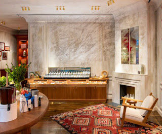 |
| Mural with store installation. |
 |
| Mural with store installation. |
It’s the whole
package. The mural, the chic urbane interior architecture, the coveted corner
shop at Prince and Mott in Nolita, it all works together so beautifully which
is why I said yes to the project. It’s atypical for me to paint a mural not of
my own design or at least as a collaboration but I was sold on the idea
especially given the 3D rendering. The inspiration is from an original sketch
by Desmond Knox-Leet, the painter and one of the founders of Diptyque. And the
notion of taking his scratchy little jot and rendering it mural size:
brilliant.
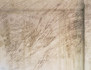 |
| Mural close-up. |
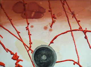 |
| Ink, watercolor, gouache on paper 2013 |
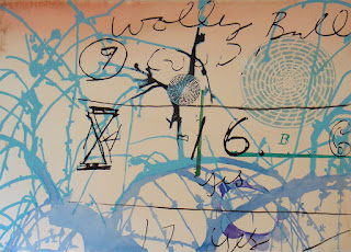 |
| Ink, watercolor, gouache on paper 2011 |
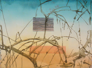 |
| Ink, watercolor, gouache on paper 2011 |
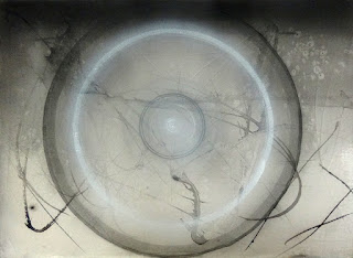 |
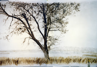
| Ink, watercolor, gouache on paper 2017 |
Metaphorically
like a diptych they live side by side; my commission projects and my studio
practice as a painter. I take techniques and ideas I develop in commissions and
use them in my own work and vice versa. Sue and I established a procedure and found
tools specifically for the Diptyque mural. The project was recreating Desmond’s work
though it could have been based on one of my own gnarly paintings/drawings.
It’s my working method to make a watercolor sketch to scale when planning a
mural commission so I think of all of my work as potentially panoramic. Scrappy
sketchy scrawls, check, I’ve done that. You have a wall; I have an idea.
 |
| My Kiawah Island mural (studio view) 1997. |